Middle: A Balanced Handwritten Font for Digital Design
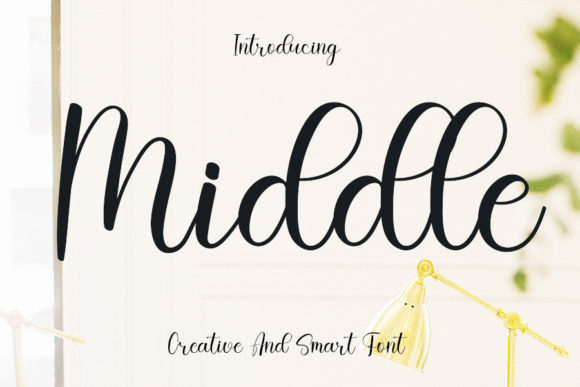
As a web and UI designer, I reach for fonts that do more than look pretty—they need to perform. Middle is one of those rare handwritten fonts that lands with quiet confidence across digital interfaces. It’s not overly delicate like some script fonts, nor does it sacrifice personality for legibility. Designed with intention, Middle strikes a thoughtful balance: strokes are neither too thin nor too thick, letterforms vary just enough to feel human, and the rhythm supports both visual interest and clean hierarchy.
In practice, Middle shines where tone and clarity must coexist—hero sections on SaaS landing pages, boutique online store banners, coaching website headlines, or portfolio site titles. Its warmth invites attention without demanding it. Unlike high-contrast scripts that vanish on small screens or blur over image overlays, Middle maintains presence at 24px and up—even on mobile viewports—thanks to its open counters, generous x-height, and consistent stroke weight.
For conversion-focused layouts, Middle works best in strategic, limited roles. Use it for hero titles, section headers, CTA buttons (with ample padding), or short brand taglines—not body copy or long navigation labels. On a course sales page, pairing Middle with a neutral sans serif like Inter or Manrope creates immediate contrast: the script font carries voice and emotion, while the sans serif delivers scannable, trustworthy information. That dynamic builds credibility fast.
Visual hierarchy benefits directly from Middle’s natural variation. Letters connect fluidly but never crowd; ascenders and descenders have breathing room, so lines don’t visually bleed together. That means your headline stands out even when placed over subtle gradients or soft photo backgrounds—no extra text shadow needed. For dark-mode interfaces, Middle retains legibility against charcoal or deep navy, especially when set at 32px or larger with 1.2 line height.
Brand identity gains consistency when Middle anchors key touchpoints. Imagine a creative entrepreneur using it across their logo lockup, email newsletter headers, and Instagram story templates. Because Middle feels intentional—not trendy—it avoids dating your design. It supports calm, confident, and human-centered brands: wellness studios, independent publishers, handmade goods shops, and thoughtful SaaS tools.
Readability on mobile remains strong when used thoughtfully. Avoid setting Middle smaller than 20px on iOS or Android. For buttons, ensure tap targets stay at least 44×44px, and add subtle letter-spacing (0.5–1px) if rendering feels tight on older Android browsers. Test contrast against light and dark backgrounds using WCAG guidelines—Middle performs well at AA level when paired with #2D3748 or #1A202C on white, or #F7FAFC on dark.
Font pairing is where Middle reveals its versatility. With sans serifs, it adds soul without clutter. With low-contrast serifs like Merriweather or Cormorant Garamond, it introduces editorial warmth—ideal for blog headers or digital magazine layouts. Avoid pairing it with other decorative scripts or ultra-thin display fonts; Middle thrives alongside typefaces that know when to step back.
Middle belongs to the Script Amp category—a curated collection of expressive yet functional script fonts built for real-world digital use. As a Fonts product, it ships in WOFF2 and WOFF formats for optimal web performance, includes standard OpenType features (ligatures, contextual alternates), and supports Latin-based languages including extended diacritics. No variable weight axis, but its single, carefully tuned style eliminates decision fatigue—what you see is what works.
Licensing is straightforward and practical. The commercial license covers unlimited websites, client projects, SaaS dashboards, online stores (Shopify, WooCommerce), digital templates, and branded assets—including downloadable PDFs and social media kits. You’re free to embed Middle via CSS @font-face, self-host, or use it in Figma design systems. Just avoid redistributing the font files themselves or converting them into editable vector outlines for resale.
In portfolio sites, Middle gives projects instant character. Try it for project titles overlaid on case study thumbnails—its gentle curves echo hand-drawn wireframes or sketch-style UI elements. For e-commerce banners, use it sparingly: “New Collection” or “Handcrafted Just For You” gains sincerity without sacrificing speed. On a founder’s personal site, Middle in the masthead signals approachability; switch to a crisp monospace for code snippets or technical details beneath—creating layered, memorable typography.
It’s also effective in micro-interactions. Hover states on buttons can subtly animate letter-spacing or lift the baseline by 1px—small touches that reinforce brand polish. In email headers or newsletter subject lines (rendered as web-safe fallbacks where needed), Middle’s personality survives even when substituted, because its structure informs the fallback choice: a rounded sans serif like Nunito or Quicksand keeps the friendly tone intact.
What sets Middle apart isn’t novelty—it’s reliability. It doesn’t try to be everything. It’s a premium font that knows its role: to elevate moments of human connection in digital space. Whether you’re refining a checkout flow, launching a new product page, or building a cohesive brand kit, Middle delivers tone with precision, not excess. And in today’s interface landscape—where clarity competes with noise—that kind of restraint is quietly powerful.
If you’ve hesitated before with script fonts—worried about load time, licensing confusion, or desktop-only rendering—Middle removes those barriers. It’s optimized, licensed clearly, and designed to work where users actually are: scrolling on phones, scanning landing pages, clicking CTAs, trusting brands through type. That’s not just good typography. It’s good design stewardship.